


Design In Town And Village
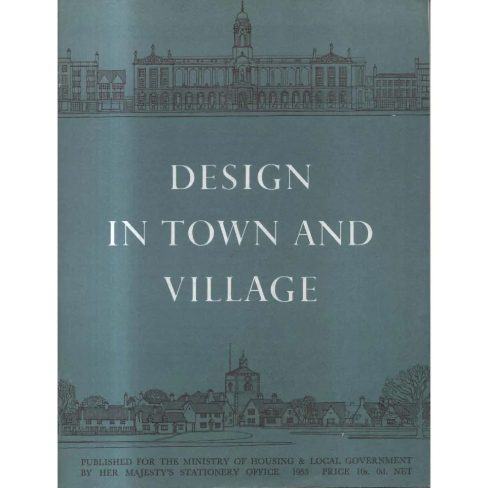
Publisher: HMSO
Format: Paperback
ISBN: none
Design in Town and Village (1953) — HMSO
HMSO | ISBN: — (pre-ISBN, proudly) | Condition: Good | Sold by Crappy Old Books™
A small book with very tidy manners. Design in Town and Village arrives from post-war Britain with a tape measure in one hand and civic virtue in the other, intent on rescuing the public realm from visual litter and architectural sulks. It’s a field guide to the polite arrangement of life: how to place a bus shelter without starting a feud, which shopfronts deserve to keep their eyebrows, and why a lamp standard should never look as if it’s shouting.
Think of it as the style guide for streets—produced by the most British of publishers, Her Majesty’s Stationery Office—at the moment when towns were rebuilding and villages were bracing for progress. The tone is earnest, practical, faintly droll: by all means modernize; kindly refrain from being hideous.
What’s inside (besides diagrams that could calm a parish council):
-
Shopfronts with self-control: proportions, mullions, and lettering that uses its indoor voice.
-
Village greens that stay green: planting, paths, benches, and why fences should apologize for existing.
-
Street furniture, not street clutter: bus stops that don’t sulk, kiosks that don’t brag, bins that behave.
-
Utilities in disguise: substations and pump houses taught to look respectable in brick jackets.
-
Signs, signals, fingerposts: a sermon on brevity, a hymn to legibility, and a warning about the perils of too many arrows.
-
New roads, old places: the dark art of widening lanes without subtracting charm.
-
Before/after plates: the original glow-ups, showing how a little restraint can save a whole street from itself.
Why it’s still weirdly useful (and very entertaining):
-
It reminds you that taste is a public service.
-
It’s a crash course in human scale before “human scale” became a keynote slide.
-
It teaches typography as planning: a neat fascia board keeps the peace.
-
It’s full of doable fixes—paint this, move that, hide those cables—perfect for anyone who has ever shouted “why is that box there?”
Historical pleasures:
-
The cordial certainty that hedgerows have rights.
-
A belief that a town can be modern without becoming loud.
-
The suspicion that the worst thing you can do to a village is “improve” it too quickly—second only to not improving it at all.
About this particular copy: Condition: Good, via Crappy Old Books, whose name is an act of municipal modesty. Expect a firm binding (possibly stapled with dignity), honest edgewear, crisp pages, and illustrations ready to win arguments at planning meetings. If there’s an elderly pencil tick by “unsuitable canopies,” consider it a blessing from a bygone clerk.
Possible side effects:
-
Compulsive labeling of street furniture by genus and temperament.
-
A desire to write stern yet loving letters about inappropriate vinyl signage.
-
Unexpected affection for fingerposts.
-
Bringing a measuring tape to the pub “just to check that fascia.”
A tiny epigram for your jacket pocket:
Good places whisper;
bad ones shout.
Design decides the volume.
If you’ve ever wished your high street would tuck in its shirt, or your village green could stop being photobombed by an impertinent substation, this is your handbook—half manifesto, half instruction manual, wholly committed to the radical notion that public beauty is everyone’s business. Crappy Old Books has a copy. Your parish council has been warned.
Keep browsing: See more Architecture books Other books by HMSO
